Pages

Saturday, October 29, 2011

ADX Indicator

The ADX index measures the strength of a trend and can be usefull to ditermine if a trend is strong or weak.When this indicator is showing a low reading then a trading range is likely to develop. Avoid stocks with low readings! You want to be in stocks that have high readings.

This indicator stands for Average Directional Index. On some charting packages there are two other lines on the chart, +DI and -DI (the DI part stands for Directional Indicator). Ignore these lines. Trying to trade according to these two lines is a great way to lose money!

The only thing that we are concerned with is the ADX itself.

Note: This indicator measures strong or weak trends. This can be either a strong uptrend or a strong downtrend. It does not tell you if the trend is up or down, it just tells you how strong the current trend is!

Let's look at a chart:

chart of adx indicator

In the chart above, the ADX indicator is the thick black line (arrow). The other lines are the +DI and รข€“DI (ignore these). The highlighted areas show how this indicator identifies trading ranges. ADX is showing a low reading and the stock is chopping around sideways.

Now look at what happens when the indicator gets into higher territory. A strong trend develops! These are the type of stocks that you want to trade.

On the right side of the indicator panel you will see a scale from 0 to 100 (only 0 through 80 are marked). Here are my guidelines for using the scale:

ADX Indicator Scale

If ADX is between 0 and 25 then the stock is in a trading range. It is likely just chopping around sideways. Avoid these weak, pathetic stocks!

Once ADX gets above 25 then you will begin to see the beginning of a trend. Big moves (up or down) tend to happen when ADX is right around this number.

When the ADX indicator gets above 30 then you are staring at a stock that is in a strong trend! These are the stocks that you want to be trading!

You won't see very many stocks with the ADX above 50. Once it gets that high, you start to see trends coming to an end and trading ranges developing again.

Tips

The only thing I use the ADX for is an additional filter in my scans, so that I can find stocks that are in strong trends. I do not even have the ADX indicator on the charts that I look at when I am looking for setups. Since the ADX is already factored into the scans, I don't need it added to the chart itself.

I don't pay any attention to the rising and falling of the ADX indicator. Stocks can go up for long periods of time even though the ADX may be falling (indicating that the trend is getting weak). The ideal scenario is that the ADX is rising, but I don't find it necessary to take a trade.

I don't use any technical indicators on my charts. I found out that technical indicators just clouded my judgement. One technical indicator may indicate a buy and one may indicate a sell. Needless to say, this can be very confusing and it just takes you attention away from the only thing that matters - PRICE.

So what is the ADX indicator good for?

This indicator is best used for screening stocks and writing scans. By adding this indicator to your scanning software, you can eliminate all of the stocks that are in trading ranges. You can then set up your scan to find only those stocks that are in strong up trends or strong down trends.

The ADX indicator does not give buy or sell signals. It does, however, give you some perspective on where the stock is in the trend. Low readings and you have a trading range or the beginning of a trend. Extremely high readings tell you that the trend will likely come to an end.

Candlestick Patterns

hey must be combined with other forms of technical analysis to really be useful. For example, when you see one of these patterns on the daily chart, move down to the hourly chart. Does the hourly chart agree with your expectations on the daily chart? If so, then the odds of a reversal increase.

The following patterns are divided into two parts: Bullish patterns and bearish patterns. These are reversal patterns that show up after a pullback (bullish patterns) or a rally (bearish patterns).

Bullish Candlestick Patterns

bullish candlestick patterns

Engulfing:This is my all time favorite candlestick pattern. This pattern consists of two candles. The first day is a narrow range candle that closes down for the day. The sellers are still in control of the stock but because it is a narrow range candle and volatility is low, the sellers are not very aggressive. The second day is a wide range candle that "engulfs" the body of the first candle and closes near the top of the range. The buyers have overwhelmed the sellers (demand is greater than supply). Buyers are ready to take control of this stock!

Hammer: As discussed on the previous page, the stock opened, then at some point the sellers took control of the stock and pushed it lower. By the end of the day, the buyers won and had enough strength to close the stock at the top of the range. Hammers can develop after a cluster of stop loss orders are hit. That's when professional traders come in to grab shares at a lower price.

Harami: When you see this pattern the first thing that comes to mind is that the momentum preceding it has stopped. On the first day you see a wide range candle that closes near the bottom of the range. The sellers are still in control of this stock. Then on the second day, there is only a narrow range candle that closes up for the day. Note: Do not confuse this pattern with the engulfing pattern. The candles are opposite!

Piercing: This is also a two-candle reversal pattern where on the first day you see a wide range candle that closes near the bottom of the range. The sellers are in control. On the second day you see a wide range candle that has to close at least halfway into the prior candle. Those that shorted the stock on first day are now sitting at a loss on the rally that happens on the second day. This can set up a powerful reversal.

Doji: The doji is probably the most popular candlestick pattern. The stock opens up and goes nowhere throughout the day and closes right at or near the opening price. Quite simply, it represents indecision and causes traders to question the current trend. This can often trigger reversals in the opposite direction.

Bearish Candlestick Patterns

bearish candlestick patterns

You'll notice that all of these bearish patterns are the opposite of the bullish patterns. These patterns come after a rally and signify a possible reversal just like the bullish patterns.

Ok, now it's your turn! I'll let you figure out what is happening in each of the patterns above to cause these to be considered bearish. Look at each candle and try to get into the minds of the traders involved in the candle.

Kickers

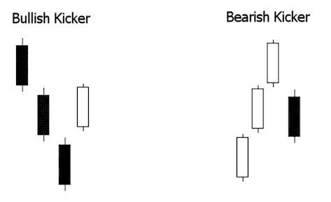
There is one more pattern worthy of mention. A "kicker" is sometimes referred to as the most powerful candlestick pattern of all.

kicker candlestick patterns

You can see in the above graphic why this pattern is so explosive. Like most candle patterns there is a bullish and bearish version. In the bullish version, the stock is moving down and the last red candle closes at the bottom of the range.

Then, on the next day, the stock gaps open above the previous days high and close. This "shock event" forces short sellers to cover and brings in new traders on the long side.

This is reversed in the bearish version.

Wait For Confirmation?

Most traders are taught to "wait for confirmation" with candlestick patterns. This means that they are supposed to wait until the following day to see if the stock reverses afterward. This is absolutely ridiculous!